
Interpreting Scientific Figures and Statistics
Correlation does not equal causation. John Lester, via Flickr. Distributed under a CC BY 2.0 license.
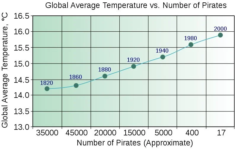
Data visualizations can be powerful tools for communicating science. But careless or incorrect figures can misrepresent data and mislead the public. If you look out for a few common errors, you can be a savvier consumer of data visualizations.
Check out the factsheet I wrote for the American Society of Human Genetics: Interpreting Scientific Figures and Statistics.